Contents
- Thesis Statement
- Abstract
- Minimalism in Design
- Use of Minimalism in Design
- Study of Gender Stereotypes – Men are from Mars, Women are from Venus
- How Stereotypes translate into design
- Gender Stereotypes and Washroom signage
- The Debate against Gender Neutral Washroom Signage
- Gender Neutral Washroom Signage
- Interview
- Documentation
- Conclusion
- Reflection
- Citations
- Bibliography
Thesis Statement
This project aims to study and analyse use of gender stereotypes in minimalist washroom signage in order to create gender neutral washroom signage.
Abstract
Minimalism was first seen in the 1860s, and it influenced everything from art, music, literature to design. This school of thought explores simplification of forms through basic shapes, forms, colours and typography. This paper examines minimalism in communication design and specifically looks at minimalist washroom signage design. It also studies gender stereotypes across the globe and attempts to correlate the two by analysing how these stereotypes affect signage design and thus, affect our perception of ‘gender’. Washroom signage design will be studied from five perspectives – attire displayed, characteristics highlighted, preferences depicted, signage colours and form of the signage.
- Attire – This perspective examines dressing style, hair, shoes and other such external features displayed by the signage.
- Characteristics – This looks at the underlying meaning shown by the signage, such as the concepts of ‘masculinity’ and ‘femininity’.
- Preferences – This studies how each signage defines what each gender must do and like.
- Colour – Each gender is often assigned a colour (often pink for the woman and blue for the man). This perspective looks at the use of such ‘pre-defined’ colours given to each gender.
- Form – This examines the overall form of the signage.
The paper will further introduce the concept of gender-neutral bathrooms and study the signage used by such gender-neutral bathrooms.
Minimalism in Design
The Cambridge dictionary defines minimalism as ‘belonging or relating to a style in art, design, and theatre that uses the smallest range of materials and colours possible, and only very simple shapes or forms’. Minimalism explores only the very essential parts of an artwork or design. It is design at its most basic structure, stripped of all superfluous elements, colours, forms or textures. For most part, minimalism follows the Occam’s razor theory. It is ‘described as ‘the simplest answer is most often correct,’ although this is an oversimplification. The ‘correct’ interpretation is that entities should not be multiplied needlessly.’ 1
Also known as Hard-edge painting, it is ‘characterized by large, simplified, usually geometric forms on an overall flat surface; precise, razor-sharp contours; and broad areas of bright, unmodulated colour…….Minimal hard-edge painting is the anonymous construction of a simple object.’2
Minimalism focuses on the interpretation of the piece by the viewer. The repetitive forms emphasize the subtle differences in the viewer’s perception of the elements that make up the piece. 3
The movement was a reaction to the decorative art style of the previous years – abstract expressionism. Abstract expressionism was personal and expressionists sought to express their emotions on the canvas through dribbled, smeared and splashed paint. Minimalists felt this art style as pretentious and overly-personalized. They attempted to create art that referred to nothing but itself.
Several parts of minimalism were derived from the de-stijil movement in the 1920s. Dutch artists and designers united and applied the basic principles of cubism to their paintings to give way to de-stijil, meaning ‘the style’. The artistic vocabulary of this movement consisted of geometric forms, straight lines and shapes and primary colours plus black and white. De-stijil movement also led to the rise of a new movement termed as neo-minimalism. Neo-minimalists build upon the same principles as minimalists, and, in addition, create contrasts through use of bright colours and geometric lines.
Minimalism is also said to have originated from traditional Japanese design which relies on Zen and simplicity. Unnecessary details and flourishes were discarded. The Japanese integrated their Zen culture into their buildings and this influenced western architecture in the 18th century and also inspired minimalist architecture in the 19th and 20th century.
While minimalism began blossoming in the 1959-60, the actual term minimalism was first coined by Robert Wollheim in his essay ‘Minimal Art’ in 1965. 4 Although several names for the art movement floated into recognition, such as A.B.C. art, Reductive Art, literalism, systemic painting and Art of the Real, the word ‘minimalism’ stuck because it explained the reduction in elements.
Minimalist movement began in the field of fine arts, and then moved to sculpture and further on. Russian artist Kazemir Valemich’s famous painting ‘Black Square’ (1915) that displayed a black square on a white ground from first showed reductionist tendencies of modern art.

Fig 1. Kazimir Malevick, The Black Square, 1915, Oil on linen canvas, 79.5 cm x 79.5 cm, Tretyakov Gallery, Moscow
Another painting by Robert Rauschenberg in 1951 also leaned towards minimalism as shown through his works featuring seven panels of white paint on unprimed canvas.
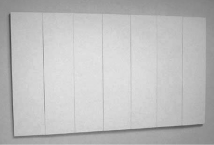
Fig 2. Robert Rauschenberg, White Painting [seven panel], 1951. Oil on canvas, 72 x 125 inches (182.9 x 320 cm). Robert Rauschenberg Foundation, New York, New York
The movement of minimalism, however, truly began in New York in 1960s. Frank Stella, based in New York, was one of the first artists to be linked to minimalism. His artwork succeeded that of Robert Rauschenberg. Stella gained fame and entry to the world of minimalist art through his series of ‘Black Paintings’. Each painting consisted of a black background with multiple, closely-spaced thin white lines.
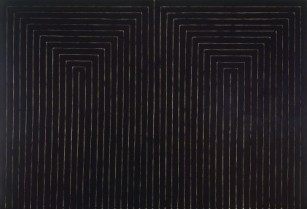
Fig 3. Frank Stella, The marriage of reason and squalor II, 1959, Enamel on canvas, 230.5 cm x 337.2 cm, MOMA, New York
As Stella quoted: “What you see is what you see.” ‘He ultimately went on to create large-scale freestanding sculptures, architectural structures, and the most complex work ever realized in the medium of printmaking. Stella’s virtually relentless experimentation has made him a key figure in American modernism, helping give rise to such developments as Minimalism….’ 5
These group of artists indulging in minimalism were referred to as minimalists or hard-edges.
As the influence of modernism expanded, minimalism began spreading into the field of sculpture. “In a discussion with Frank Stella, who was named as a principal influence on the object-sculptors, Donald Judd, one of the most prominent of minimalist sculptors…..insisted that ‘You should have a definite whole and maybe no parts, or very few . . . The whole’s it. The big problem is to maintain the sense of the whole thing’….”6
Minimalism soon expanded from sculpture to include architecture and design. An architect famous for being a key figure in the minimalist movement is Ludwig Mies van der Rohe. Mies tried to create simplistic and clear building designs through use of steel, glass and open spaces. Several of his principles are used today, not only in architecture but also in design.
Designers were concerned with the permanence, structure and timelessness of their design. As the 1970s approached, however, designers ‘adopted the minimalist style not for social change, but as an aesthetically and economically attractive technique.’ 7
Minimalism continued to diversify into various other fields and the movement began breaking apart until each artist developed their own personal directions. Minimalism soon gave way to the Post-minimalism period. While minimalist artworks were impersonal and objective, post-minimalist artworks tried to find expression in expressionless forms.
Certain criteria of minimal art are still followed by artists and designers around the globe. Current minimalist trends dictate that the focus rest on one major element of the visual.
Difference between minimalism in art and design
The line between art and design is fine and complex in its understanding. One often finds artists who call themselves designers and vice versa. Designers mostly – emphasizing the word mostly – attempt to create functional pieces that tend to a requirement imposed by the client, while artists create pieces that are more personal and decorative than practical.
Similarly, in minimalist art, the artist reduces the amount of artwork so as to enhance his opinion of the subject more than the piece itself. In minimalist design, however, the designer reduces his / her own interference of his / her personal sentiments so as to enhance the piece.
Difference between simplicity and minimalism
At its core, minimalism is stripping the elements of its superfluous elements until only the absolutely necessary components remain. It is the reduction of quantity. Simplicity is the reduction of complexity. While minimalist design is generally simple, simplistic design may not necessarily be minimalist.
Use of minimalism in design
Minimalism is designed around the content, and this is the technique’s USP. Its key feature is ‘less is more’ and tends to reduce quantity of elements present in the design so as to highlight the message to be conveyed.
Minimalism in design can be used in several ways, such as those explained below:
- Contrast – Using opposing elements to highlight concepts adds instant allure to the design. Contrast can be defined in terms of colour (black and white designs are often popular), typography (in terms of size) and composition. Adding the element of contrast also improves the readability of the design, thus improving its effectiveness as a whole. However, one must learn the difference between contrasting and conflicting elements.
- Space / Composition – Each element of the design must stand and have a place of its own. Minimalist design rarely looks cramped. More importantly, every component must be readable and clear. Moreover, placing one visual that dominates the design often works. This technique directly connects to contrast. Here, the word ‘dominant’ does not necessarily mean ‘large’.
- Colour – Minimal designs are often limited to one or two colours.
- Typography – The general kind of typography used in minimal design is often simple, with bold strokes. However, one can pull off minimalist designs even through use of complex, script fonts.
Signage design and use of minimalism
Signage design comes under the topic of wayfinding. Wayfinding informs people of their surrounding environment and displays information at strategic points to guide them in the right direction.
Wayfinding signs are generally of four types:
- Directional signage – points the way towards a particular building or object
- Informational signage – gives information such as operating hours, services available, etc.
- Safety / Security signage – gives safety or security related information such as emergency procedures, health hazards, etc.
- Identification signage – ascertains the facility / building / object available at the spot
Signage design must observe the following:
- Consistency in fonts, sizing of visuals / text, grid design and spacing as well as material
- Easily readable
- Use symbols that can be understood by the general public
- Design of the signage must ‘fit in’ with the surroundings in terms of style and material while at the same time remain easily noticeable
Minimalism in signage design is often the norm as non-minimalist signage would not instantly clarify the required information.
One of the earliest intuitive signage for public lavatories was found in mid 1960s for the British rail. Design studio DRU (Design Research Unit) devised a modern, aesthetic design that was implemented across locomotives, stations, published materials and lavatories. The United States developed the British signage on a thorough basis in the 1970s. It was finally in 1974 that bathroom signage became more or less standardized through the collaboration of US Department of Transportation and American Institute of Graphic Arts who created 50 such pictograms.8
Materials and processes used in creation of signs
Some common materials found in washroom signage design are acrylic, aluminium composite panels, polyethylene, PVC, vinyl, polycarbonate.
Signs are generally created using the following methods:
- Laser cutting – A laser beam of high intensity is focused upon the material and this marks the material through rapid heating, melting or vaporising of the material.
- Printmaking – The artist coats a drawing of the image with ink which is them printing using roller press of hand press.
- Screen printing – The image to be printed is transferred to a fine fabric and the areas which are not to be printed are blocked off using resin. The ink is then rolled across the fabric such that the unblocked areas allow passage of the ink. This results in the image being duplicated on the material placed below the fabric.
- Painting – The artists physically paints on the material using various types of paints and brushes.
- CNC Router – It uses computer software and electronics to carve an image onto the material. This process is generally very precise and is similar to laser cutting.
Study of Gender Stereotypes – Men are from Mars and Women from Venus
Introduction to gender stereotypes
Humans thrive on variety. To break down this variety into categories and define each category with ‘how they are expected to be’ is to violate our right to exist as separate individuals. This process of breaking down of society to fit into ‘categories’ or ‘boxes’ is known as stereotyping. Stereotype may be defined as a set idea that people have about what someone or something is like especially an idea that is wrong. 9
Stereotypes often do the following:
- Stereotypes intensify differences between two particular groups, however small the difference may be. Most stereotypes often contain a kernel of truth, and this is so because actions are often unconsciously based on stereotypes that are commonly found around us. This makes it harder for society to distinguish between stereotypes and the truth. For example, a woman is generally expected to do housework and cleaning tasks. This stereotype is so innately drilled into our subconscious mind that we often do not question it when a woman says she is a ‘housewife’. In fact, most home-makers are women and this has developed due to the growing influence of this stereotype. However, when a man works inside the house and the woman is financially supporting the house, the action is considered unusual and often results in ridiculing the male.
- Stereotypes depend on the context they are viewed in. ‘For instance, when comparing Irish to Scots, the stereotype of Irish may change from “red-haired” to “Catholic”.’10
- Stereotypes distort information to suit the belief and this may take a negative toll on those believing the stereotype. For example, it is generally said that ‘men are taller than women’. This may affect short men who will then tend to over compensate for their height, considering themselves to not be ‘manly’ enough.
Stereotypes are omnipresent. ‘Among other things, they cover racial groups (“Asians are good at math”), political groups (“Republicans are rich”), genders (“Women are bad at math”), demographic groups (“Florida residents are elderly”), and activities (“flying is dangerous”).’11
While not all stereotypes are inaccurate, such as ‘Dutch people are tall’, some are less accurate than others, like ‘women are bad at math’. Stereotypes may change with times, for example, at the beginning of 20th century, Jews in the US were viewed as religious and uneducated. However, at the beginning of the 21st Century, they began to be looked at as high achievers.12
Stereotype vs Generalisation
One must, however, understand the differences between a ‘stereotype’ and a ‘generalisation’.
Generalisations are often sensitive to cultural differences and are based on multiple observations rather than assumption, unlike a stereotype. It informs the public about cultural, historical, geographical and other such characteristics while at the same time allowing for differences within the group. On the other hand, stereotypes are based on inaccurate and small number of observations. In fact, they are often based on assumptions. This results in an improper perception of an individual or group. They are not open for reflection and correction.
Generalisation can turn into stereotyping due to over simplification of certain characteristics of a group. While all stereotypes are based on generalisations, not all generalisations are stereotypes.
For example, ‘All Americans are obese’ would be a stereotype, however, ‘Americans have greater likelihood for being obese than other countries due to increased quantity of processed food’ would qualify as a generalisation. One must keep in mind that both generalisations and stereotypes can be equally harmful after a point.
Gender Stereotypes
Gender stereotypes are exaggerated images of men and women which are, more often than not, untrue. 13
They pit men and women into opposing groups and dictate what each group must prefer and behave like. Gender Stereotypes are a result of ‘nurture’ rather than ‘nature’. Gender stereotyping begins right from birth. A girl’s room is decorated with pink and she is gifted skirts and dolls. A boy, on the other hand, is given footballs and remote controlled cars. Their room is often painted blue.
A stereotype is wrongful when it violates human rights and fundamental freedoms. It can be harmful when it limits the person’s capacity to develop themselves and their capabilities.
Origin and development of Gender Stereotyping
Danish economist, Ester Boserup, in the year 1970, put forth a hypothesis that gender roles first originated from the agricultural practices followed in the pre-industrialization period. Societies that practiced plough agriculture, rather than shifting agriculture, developed gender specific roles. Men worked on the fields, while women specialized in activities within the house. Neither of them, however, were looked upon as an inferior gender. These roles first created norms for society and how each gender was supposed to behave. The use of plough agriculture can be divided into three mutually exclusive sects:
- The plough was absent
- The plough was not indigenous
- The plough was indigenous
The extensive database prepared by National Bureau of Economic Research suggests that there is a negative relation between the plough and role of woman in society. The increasing use of plough has been co-related with a reduction in female participation to a degree of 0.86, which is large as compared to standard deviation 1.0.14
These roles were further enhanced in the coming centuries. It became a norm for the men to work outside the house while the women worked inside. It was assumed that men had natural capability to work outside while the women lacked this capability.
Gender roles are closely linked with development of stereotypes. Gender roles can be called ‘prescriptions’ of gender stereotypes. They present patterns of what individuals or groups must do under certain situations.
Stereotypes were never constant – they often changed with the passage of time.
During the 16th and the 17th centuries, men in Europe wore high heeled shoes as a definition of power and a demonstration of their wealth. Women did not begin wearing heels until the 19th century.
Before the emergence of gender roles for colours blue and pink, children were dressed in white until the age of six, and men would have long hair up until the age of seven. It was just before the World War I that gender based colours began to emerge. Initially, Blue was considered to be a more feminine colour whilst pink was connected to masculinity due to its perceived power. One must note that, at this point, men were still considered to be ‘powerful’ as compared to women. ‘A June 1918 article from the trade publication Earnshaw’s Infants’ Department said, “The generally accepted rule is pink for the boys, and blue for the girls. The reason is that pink, being a more decided and stronger colour, is more suitable for the boy, while blue, which is more delicate and dainty, is prettier for the girl.”’15
It was during the women’s liberation movement in the 1960s that women rebelled and began wearing ‘masculine’ colours and this defined the trend of ‘unisex’ clothing. Women began wearing pink. The colours switched their purpose. It wasn’t long before the world picked up. The ‘pink and blue trend’ spread from clothing to other merchandise. Advertisers began selling their products to gender specific individuals.
“It is logical to assume that gender stereotypes today are the product of cultural bias that is found on many different levels of society—in the home, in the media, on the playground, and in the classroom—which then perpetuates into later workplace, affecting our identity/sense of self and our relationship with others.”16
Gender Similarities Model
The media is predominantly run by two models regarding gender roles and stereotypes. These are the Gender differences model and the Gender similarities model. The Gender differences model states that men and women are very different from each other, both biologically and psychologically. The Gender Similarities Hypothesis was suggested by Jane Hyde, UW Madison, as a direct disagreement to the differences model. Hyde tested her model by analysing the meta-analyses of gender differences (reviewing several studies, often in hundreds or thousands, to test the trueness of a hypothesis). She came to the conclusion that the differences between two genders are next to negligible, and are only largely present in domain of motor performance, sexuality, and attitudes about casual relationships. However, the beliefs or stereotypes present in society leads to self-fulfilling prophecies. For example, ‘Women are bad at math’, or ‘Men have trouble communicating’ only stands true in today’s generation due to the individual’s or society’s belief in the stereotype.17
How Stereotypes translate into design
Gender stereotypes are enforced or intensified through a variety of media like newspapers, magazines and advertisements. The advent of the digital age has further spread the reach of media across the globe. Media has the power to create and change social norms. Design and Media ae often closely connected due to the fact that it influences the way we look at a design.
A typical 19th century Britain house would contain drawing rooms for the women, coloured in soft pastel colours and study rooms and libraries for the men coloured in dark, mahogany colours. Even now, while decorating a room meant for women, the curtains or other decor are generally of light colours like pink, peach and cream. A room for a man would contain darker, solemn colours like green or brown. This depicts the gender bias found in design industry ever since the earlier times.
‘Historically, men have occupied power roles in offices, so male necessities dictated the design of prime spaces, while the female secretaries occupied ancillary areas. The Modernist mass-production model, paired with this male-centric paradigm, lingers even in today’s information age—the world of technology and web design is also a very male-dominated field, with 85 percent of tech workers at the top companies being male.’18
Although recent events have begun a wave of feminism, design is lagging behind in its approach. Gender stereotypes have translated themselves into design for the modern world. According to Jeanna Kimbre, manager of colours and materials at Sony Ericsson, Lund, ‘Why does a woman’s phone have to be pink?’ She believes products can be targeted without making categories.
While good design allows for variances between a man and woman’s physiology, it does not divide products into male and female.
Individuals are still assigned gender identities and roles, however, they are able to decide their own identity beyond this. The youth are opting to leave gender columns unspecified on their college forms and schools are accepting of the same. During the previous decades, transgenders were viewed as outcasts and were mistreated. This situation has changed over the past couple of years and the society has become more tolerant of those who ‘do not fit in’. In 1995, Martine Rothblatt, author of The Apartheid of Sex, argued, ‘There are five billion people in the world, and there are five billion unique sexual identities.’ The number may have changed, but the fact hasn’t.
Gender Stereotypes and Washroom Signage
Washroom signage often encourage gender stereotypes, albeit unconsciously.
These signs can be categorized into five kinds:
- Attire – This kind often discriminate between the two genders through dressing style, hair, shoes and other such external features.
- Characteristics – This type differentiates between the genders by looking at the underlying meaning shown by the signage, such as the concepts of ‘masculinity’ and ‘femininity’.
- Preferences – This signage often prescribes what a particular gender must do, look like and how it must behave.
- Colour – This signage looks at genders through pre-defined colours (often pink for the woman and blue for the man).
- Form – This kind of signage suggest a particular stereotype through subtle use of forms and shapes.
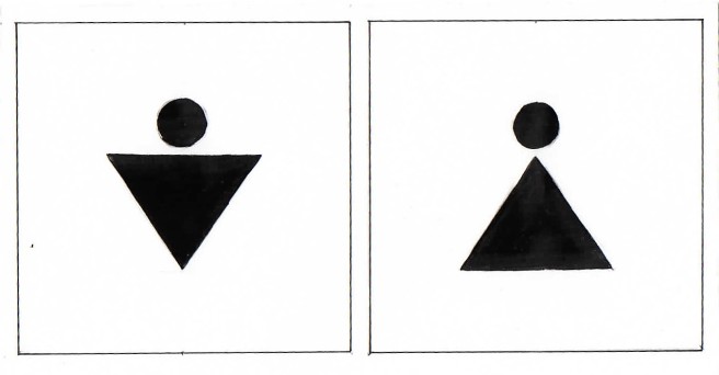
Fig 4
The signage above shows the man using a triangle pointing downwards, while the woman is shown using a triangle pointing upwards. The triangle intends to show that the woman is wearing a dress, while the man has broad shoulders. The signage also shows two exactly opposite shapes, suggesting, at a more subconscious level, that the two genders are at odds with each other.
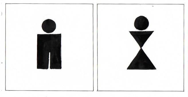
Fig 5
This sign also attempts to fit the woman in a dress using triangles. The man is shown using a thick rectangle. While the woman is shown having a waist, the man is straight.
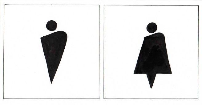
Fig 6
This signage design again indicates that the woman must wear skirts, while the man is, again, shown with broad shoulders.
Men began wearing trousers about three thousand years ago, as they were more suited for hunting and horse riding. Women began wearing skirts due to hygiene reasons, before the invention of sanitary napkins. However, what was once common soon became a tradition. The bible, moreover, promoted the use of skirts amongst women. Duet 22:5 says: ‘The woman shall not put on [the weapons/armor of a warrior], neither shall a [warrior] put on a woman’s garment: for all that do so are abomination unto the LORD thy God.’ While the bible meant to say that the men and women must not adopt each other’s habits, the verse was taken literally by society.
Clothes are a construct of society and hence should not be used as an identity. Society must allow the freedom to choose what we wish to wear regardless of our gender.
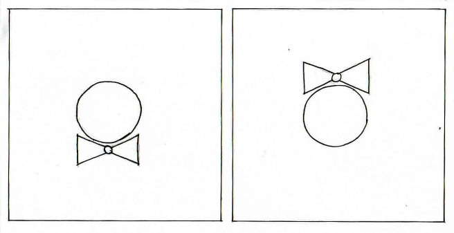
Fig 7
The man is shown wearing a bow tie on his neck, while the woman has a bow on her head. This again raises the issue of men and women being depicted as opposite to one another.
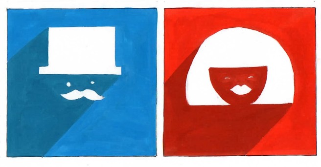
Fig 8
The man is shown wearing a hat. The wearing of a hat indicates notions of superiority. The woman has a voluminous neck length hair. While the man has his eyes open, looking straight ahead, the woman is smiling with squinted eyes. This deals with the stereotype that men are supposed to be grim, serious creatures, while women are always smiling and happy.
Here stereotypes are seen not just in the figures, but also in the colours used. Blue has been used for the boy while red for the girl, suggesting sexuality.

Fig 9
The men’s washroom is indicated using a smoking pipe, while the women’s washroom using heels.
In the 16th and 17th century, heels were used by the men to indicate power and wealth. Women began wearing heels to match up to their masculine status. Eventually, the association of heels with women increased and this forced the men to stop their use of the footwear. This has an important significance because it indicates that women were always trying to match up to the men’s standard and this has been pulled into the 21st century as well.
Smoking was considered to be a hobby exclusively for men because the activity itself was considered unfeminine. In fact, laws were passed to ban women from smoking in public areas and men were even banned from smoking near women.
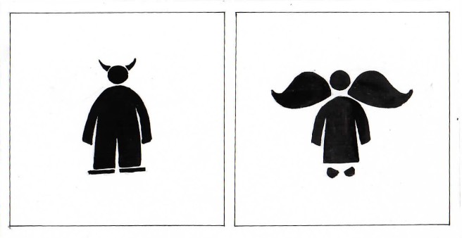
Fig 10
Here the man is shown as a devil, with horns, while the woman is supposed to be an angel, with wings. This indicates that women are expected to be good, polite and kind, while the men are brash, rude or unkind. This also indicated that women are ‘pure’ while men are not. On top of this, the women is, as she is in almost every signage, shown in a dress and the man in trousers.
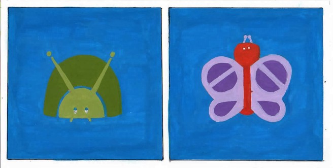
Fig 11
The woman is shown using a butterfly, delicate and pretty with ‘feminine’ colours like purple and red, while the man is shown as a bug, ugly, uncultured and a shade of dark green, a colour associated with finance, ambition, greed and jealousy.
Fig 12
This sign shows that women talk more than men. It may also mean that men are verbally or emotionally stunted i.e. unable to talk about their opinions, while women talk too much.
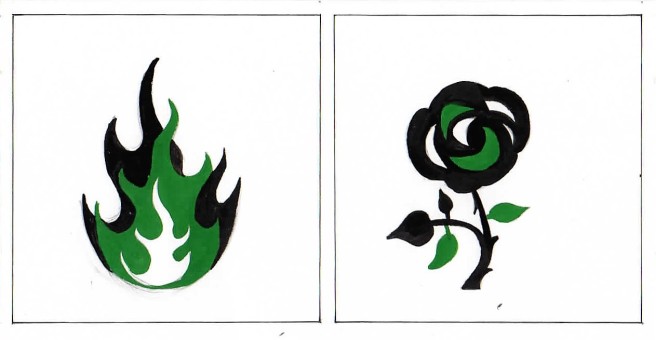
Fig 13
The men are represented by fire, while the women by a flower. Fire depicts heat, strength and power – all connecting to stereotypes regarding men. Likewise, a flower indicates delicateness, purity and beauty. The flower could also allude to the female genitalia.
Fig 14
The man is shown flexing his muscles, while the girl is looking down demurely with closed eyes. This indicates that men are required to be strong with muscular bodies, while women are to behave shyly, even coy. The girl is shown with long hair falling over her shoulders, suggesting beauty. The man’s hair is standing upright, hinting at confidence and brashness.
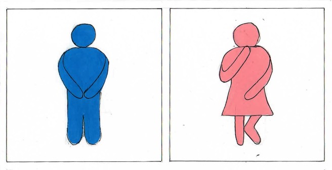
Fig 15
The man is shown standing straight, while the woman has one knee bent and a hand over her mouth, as though embarrassed. This suggests that the thought of a woman using a restroom is not acceptable.
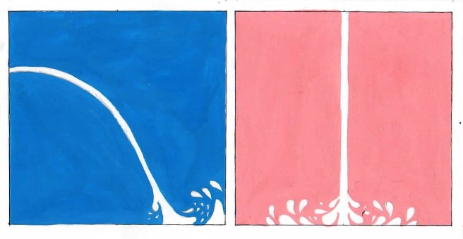
Fig 16

Fig 17
Fig 18
These three emphasize on differences between man and woman using the traditional colours blue and pink. The colour blue is supposed to be masculine, while pink indicates femininity.

Fig 19
This sign not only categorizes gender into two colours, but also dictates the sexual preferences of a gender. While it does not prohibit other sexual preferences, it does subtly expect the man to be interested in females.
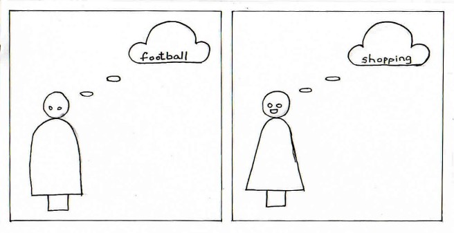
Fig 20
This sign blatantly declares what each gender must like to do – the men must like football, because men are active and the women must like shopping because women must like to dress up.

Fig 21
The signage indicates that men like beer, a drink that signifies strength and roughness while the women prefer wine, significant of class, style and politeness.
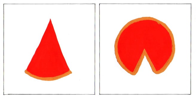
Fig 22
The sign indicates sexual genitalia of both genders. However the form of the signs seem to subtly suggest that the woman (the incomplete pizza) requires the man (the slice of pizza) to complete herself, while the man’s slice is a complete form in itself.
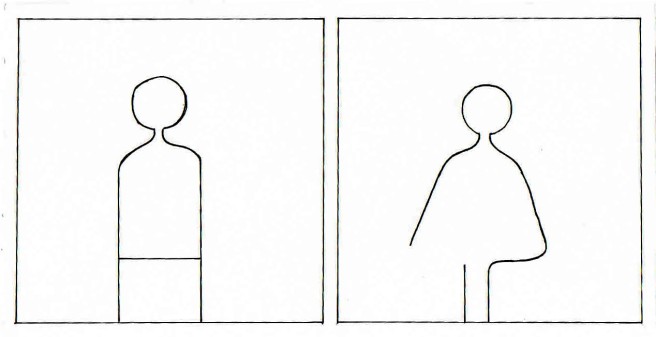
Fig 23
The form of the figures are very different from one another. The woman’s form is incomplete, and looks breakable. The man is shown stiff and straight, having a strong form, supported by the line in the middle.
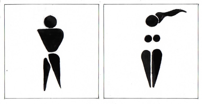
Fig 24
Here, the woman is shown by use of flowing hair and floating, disembodied breasts. There is a strong element of sexuality. The sign indicates that the woman is defined by her breasts, and nothing else.
One must realise that the messages that come off from each design may not be intended. They also may not be seen directly, but rather, are subconsciously driven into each of our minds. While not all stereotypes are offensive, we must also realize that being inoffensive does not make them ‘right’.
The debate against gender neutral Washrooms
We encounter sex-segregated washrooms nearly every area we visit. The signs used to separate the two may seem necessary and inoffensive, however, any transgender will let you know that this is not the case. The simple decision of choosing which washroom to enter may be painful or even downright dangerous for trans-people.
Unisex washrooms are not an old concept. They existed before the advent of gender-segregated washrooms. These washrooms are open to all people, regardless of their gender identity.
Sex-segregated washrooms date back to over a 100 years, in Paris (1700s). However, regulations that required men and women to use separate bathrooms only came up in the 1800s. These regulations were not created simply due to physiological differences between the two genders. Social norms of the time dictated that the woman’s place was at home and it was believed that the female gender was the weaker sex. Women required ‘protection’ and thus, separate rooms were created for the gender in every sphere of life – there were separate reading rooms, separate train cars and separate restrooms. The design of women restrooms often mimicked the comfort of homes – with curtains and sofas.
‘Public restrooms are not just toilets; for more than a hundred years, they have implicated questions of who really belongs in public, civic, and professional life.’19
While it is often said that gender segregated bathrooms protect the women or children from sex offenders, one must realize that a signage of a woman in skirt and an unlocked door is not going to stop those with wrong intentions. Moreover, gender neutral bathrooms provide a safe space for gender minorities and gender non-conforming identities. One cannot out the safety of one gender above another.
Another alternative reason as to why gender-neutral bathrooms are often rejected, is to maintain a sense of social order. ‘Each thing has its assigned place, and that makes us feel better.’20
Gender-neutral washrooms are also beneficial to those under care of an individual of opposite sex, such as a daughter and her father or a senior citizen with a nurse.
At the heart of the debate against gender neutral washroom is the issue of transphobia, meaning feelings of anger, disgust and hate towards those who do not conform to society’s definition of gender roles.
However, the popularity of gender neutral washrooms is increasing with the times, and more and more colleges, school and offices offer this facility along with the typical segregated washrooms.
Although the debate continues across the globe, we must ask ourselves – how long will visiting the washroom remain a privilege for certain sections of society and how long will we let gender define our rights?
Gender Neutral Washroom Signage
Most gender neutral signage show a human body divided in two parts – one part is male, the other part female.
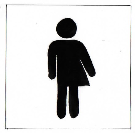
Fig 25
This sign still emphasises on the two major genders and ignores the other variety that might exist. Moreover, it categorizes the third gender into a category that is still majorly based on male and female, without considering that the third gender may be a gender of itself, and not based on any other gender.
Interview
Kunal Shah, Interior Designer
What kind of work do you do?
I am an interior designer, interior architect, so I work on spaces, and my approach is graphical spaces. For me, composition of volumes and such things are very important.
What’s your typical day’s schedule?
I wake up at around 6:30 on weekdays (Monday to Friday). I do some yoga, I read, I get to work at 10 am. I work from 10 am to 6:30 pm, with a break for lunch at 1:00 pm, for which I return back home. However, each day is different because I often go to sites.
Have you ever attempted minimalist design?
The kind of work I tend to do is simplistic, somewhere close to minimalism. I don’t believe in minimalism, I believe in simplicity.
Why do you choose to be simplistic than minimal? What drives you towards simplicity?
Ultimately, the whole idea is to live a life you want to enjoy, and enjoy in a certain quality of life, and for that you don’t need too many things, you simply need what you need. Then, minimalism can tend to be harsh. I don’t believe the need to be harsh, I compare it to the amount of salts you need to put in food. You can’t eat food without salt, but I definitely don’t think you need to put too much salt. Getting the right amount of salt, the balance is important. That is what I aim to achieve in my work.
What is your process when you start designing a particular space? How do you go about it?
It involves a lot of discussion with the clients, trying to understand what they are all about, what their requirements are, what their cultural background is, in terms of where they come from or what do they do. I try to understand the context and the space very clearly, what kind of building, what kind of neighbourhood. Those things are very important to know, and thus I do an elaborate study of that and I document it. Then we clean up the spaces as required. The process than turns towards problem solving. The aesthetics fall into place based on these things.
What are the three things you believe are most important in a design?
Simplicity, Simplicity and Simplicity.
So you are really ‘into’ simplicity.
Shouldn’t everybody be?
Yeah, that’s right. The simpler the design the more efficient it is..?
Not just efficient. It’s also more beautiful. You try to camouflage lack of substance by ornamenting too much. I always give the analogy of a fit body. If you have a fit body, you can wear a white shirt and a pair of jeans and you will still look good and be attractive. If you are unfit, you will have to wear elaborate clothes, accessorize, put on makeup, do your hair, and do all sorts of things to hide something which ideally should not be hidden. A fit person is happier, similarly, a space which is fit functions better. I don’t believe in form follows function either, it is something that goes against aesthetics. I think it should be a natural process. When you lose the fat in your body, you enjoy your experiences. Space is no different.
What is your view on gender stereotypes? How do you think it affects design?
Gender stereotyping affects everything, and design is no exception. Any kind of stereotyping then becomes so engraved in us that you need to behave a certain way, dress a certain way, do thing in a certain manner, women being the exact opposites of men….But, I think is slowly changing. Most of my clients today – the women do not enter the kitchen, the men enjoy cooking, which for me, is a very new trend. In terms, of colour, biases, I think that’s disappearing. Nobody really paints a girl’s room pink anymore. There are, however, subtle undertones, which creep in. A woman wants a softer, gentler aesthetics, those stereotypes still exist. But these stereotypes are changing mainly because women are now financially independent, as compared to earlier, they have more say in important issues, so the house tends to be more balance. To a certain extent, I would say, women generally have more interest in residential spaces. The man tends to stick to one space, his ‘den’, the nature of which is typically more masculine. Overall, I believe it’s getting more and more balanced. Common spaces like bathrooms, living rooms are becoming very gender neutral. As for commercial spaces, I don’t think they are particularly sensitive to gender stereotypes, they are all masculine. As an added afterthought, there are women’s washroom signage.
Documentation
Based on the analysis done above, the creation of a new, stereotype free washroom signage for a gender-neutral washroom is a necessity.
STEP 1: Studying various washroom signage and identifying major stereotypes in them
These were then arranged in a grid for easy comparison and reference.

Fig 26
STEP 2: Design thinking and brainstorming
This is the most important stage in the process and involved creation of a variety of options for the design. I wished to get to the bottom of what it means to be human and use the function of a washroom, rather than what it means to be of a particular gender.
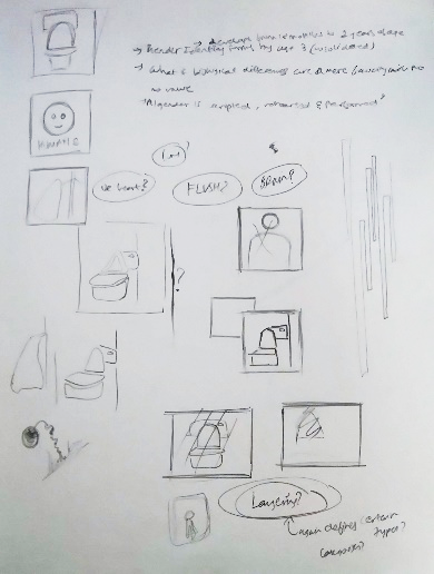
Fig 27
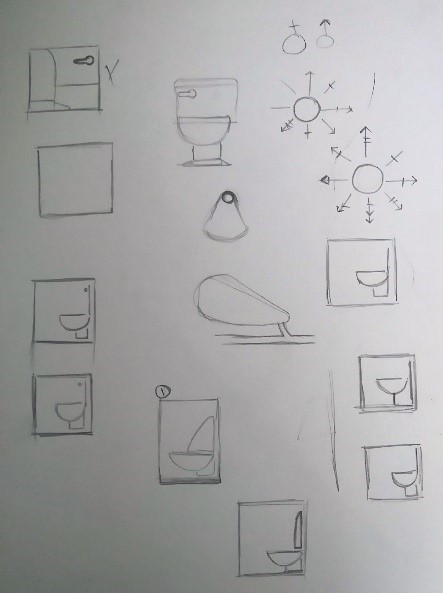
Fig 28
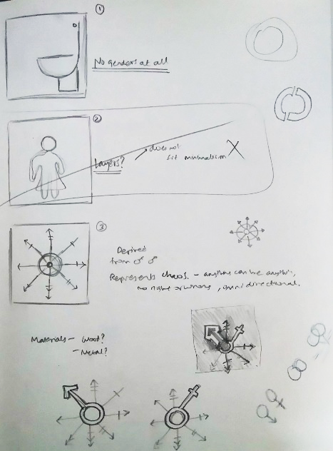
Fig 29

Fig 30
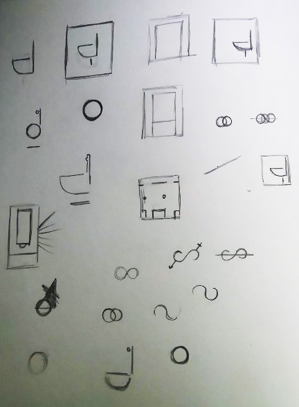
Fig 31
STEP 3: Creating Vector Drawings
This step meant choosing a select few from the options and creating finalised vector drawings of the same.

Fig 32

Fig 33
Fig 34

Fig 35

Fig 36
STEP 4: Making the Signage
The signage was created using a CNC Router machine and the markings were carved out on 6 inch by 6 inch pine wood pieces.

Fig 37

Fig 38

Fig 39
Fig 40
STEP 5: Final Product
- Playing with solid, void and gender importance

Fig 41

Fig 42

Fig 43

Fig 44
- Minimalist washroom signage

Fig 45
Conclusion
The study initially explains the history and concept behind minimalist design and explains its usage in the design world. It then sets out to analyse gender stereotypes across the globe and to apply them to minimalist washroom signage used currently. It studied various signage from the following perspectives:
- Attire
- Characteristics
- Preferences
- Colour
- Form
Gender stereotypes are unjustified evaluations regarding a particular kind of gender. They are essentially a violation of the freedom to be an individual. Stereotypes are over simplified generalizations that are based on assumptions and result in formation of an incorrect opinion about the gender. Design has the potential to change the way we perceive a group or individual through direct and/or indirect means. The trend of ‘masculine design’ and ‘feminine design’ is changing across the globe. Although a good design leaves room for biological / physical differences between genders, it does not classify the design into ‘male’ or ‘female’. Washroom signage, albeit a small part of our lifestyle, subconsciously affects the way we define the female and male gender and also affects how we perceive the third gender. Although the signage designs discussed in the study may not be directly offensive, however, being inoffensive does not make these stereotypes ‘right’.
The paper also aimed to briefly understand the concept of gender neutral washroom and signage and stereotypes used in this regard. Gender neutral bathrooms promote gender equality for all possible genders and thus make what is a ‘privilege’ to non-conforming genders, a basic right for all. Although the concept of gender neutral bathrooms already exists, it has been placed into execution by very few. It requires more aggressive campaigning and promotion amongst the masses. Large companies and national governments must take the required efforts for the implementation of this model.
The study concludes by designing a minimalist gender-free washroom signage that promotes equality for all genders.
The high point of society can only be reached when there is equality and peace between all and when society is defined by our identity as a person, not by our identity as a gender. According to Judith Butler, American philosopher and gender theorist, “There is no gender identity behind the expressions of gender….identity is performatively constituted by the every expressions that are said to be its results.”
Reflection
Not only did this project sum up learnings from Integrative Seminar and Studio, it also interwove with other subjects to create a single strand that only became coherent at the end.
A lot of the thesis was driven through research techniques learnt in the ‘Objects of History’ course from Term 1. The thesis that I worked upon for History worked as a working draft for the layout and initial points of research for this one.
Although Rapid prototyping was meant to learn software, most of my concept understanding and concept sketching was derived from the elective. Rapid prototyping required us to create chess pieces that followed a certain theme. This taught me to keep the design relevant to my topic of research while still extending certain boundaries to keep the design unique.
Space and Materiality also pulled in at the point where I had to physically create my final project. Material exploration done in the first term helped me decide upon wood as a suitable material for it.
The thesis helped me gather and apply the entire year’s learnings into one final project. It also helped me understand areas of research I enjoy and the specialization I would like to take up during the coming year.
Citations
- “Occam’s razor”, last modified on April 9, 2016, https://explorable.com/occams-razor
- Encyclopædia Britannica Online, s. v. “Minimalism”, last modified on December 18, 2014, http://www.britannica.com/art/Minimalism.
- “Minimalism, New York, 1960s”, last accessed on April 11, 2016, http://www.guggenheim.org/new-york/collections/collection-online/movements/195219
- Steven Heller, Graphic Design Time Line: A Century of Design Milestones (Canada: Allworth Press, 2000)
- “Frank Stella”, last accessed on April 9, 2016, http://www.theartstory.org/artist-stella-frank.htm
- Hartmut Obendorf, Minimalism Designing Simplicity (London: Springer-Verlag London, 2009)
- R. Roger Remington, American Modernism Graphic Design, 1920 to 1960, (China: Yale University Press, 2003)
- Johnathan Glancey, “The Genius behind stick figure toilet signs”, last modified September 11, 2014, http://www.bbc.com/future/story/20140911-the-genius-of-toilet-signs
- “Stereotype”, last accessed on May 27, 2016, http://dictionary.cambridge.org/dictionary/english/stereotype
- Pedro Bordalo, Katherine Coffman, Nicola Gennaioli, Andrei Shleifer, “Stereotypes” (Royal Holloway University of London, Ohio State University, Universitá Bocconi and IGIER, Harvard University ,November 2013)
- ibid
- ibid
- GORDON MARSHALL. “gender stereotypes.”A Dictionary of Sociology. 1998.Encyclopedia.com. (May 27, 2016). http://www.encyclopedia.com/doc/1O88-genderstereotypes.html
- Alberto F. Alesina, Paola Giuliano, Nathan Nunn, “On the origins of Gender Roles: Women and the plough” (National Bureau of Economic Research, May 2011)
- “When did girls start wearing pink?”, last modified on April 7, 2011, http://www.smithsonianmag.com/arts-culture/when-did-girls-start-wearing-pink-1370097/?no-ist
- “Gender Stereotypes: Where do they come from and why do they persist?”, last modified on April 2, 2014, http://mediasavvygirls.com/gender-stereotypes-where-do-they-come-from-and-why-do-they-persist/
- “Why gender doesn’t matter”, last modified on July 10, 2008, https://www.psychologytoday.com/blog/brainstorm/200807/why-gender-doesnt-matter
- “His and Hers: Designing for a post-gender society”, last accessed on May 17, 2016, http://www.metropolismag.com/March-2015/His-or-Hers-Designing-for-a-Post-Gender-Society/
- “Who’s afraid of Gender neutral bathrooms?”, last modified on January 26, 2016, http://www.newyorker.com/news/news-desk/whos-afraid-of-same-sex-bathrooms
- Katherine Ripley, November 11, 2011 (12:53 p.m.), “Why are bathrooms segregated by sex anyway?”, http://www.huffingtonpost.com/entry/bathrooms-segregated-_b_8524374.html?section=india
Bibliography
Aimee Lee Ball, “In all gender restrooms, the signs reflect the times”, The New York Times, last modified on November 5, 2015, http://www.nytimes.com/2015/11/08/style/transgender-restroom-all-gender.html?_r=1
Alberto F. Alesina, Paola Giuliano, Nathan Nunn, “On the origins of Gender Roles: Women and the plough” (National Bureau of Economic Research, May 2011)
Encyclopædia Britannica Online, s. v. “Minimalism”, last modified on December 18, 2014, http://www.britannica.com/art/Minimalism.
“Frank Stella”, last accessed on April 9, 2016, http://www.theartstory.org/artist-stella-frank.htm
“Gender Stereotypes: Where do they come from and why do they persist?”, last modified on April 2, 2014, http://mediasavvygirls.com/gender-stereotypes-where-do-they-come-from-and-why-do-they-persist/
GORDON MARSHALL. “gender stereotypes.” A Dictionary of Sociology. 1998. Encyclopedia.com. (May 27, 2016). http://www.encyclopedia.com/doc/1O88-genderstereotypes.html
Hartmut Obendorf, Minimalism Designing Simplicity (London: Springer-Verlag London, 2009)
“His and Hers: Designing for a post-gender society”, last accessed on May 17, 2016, http://www.metropolismag.com/March-2015/His-or-Hers-Designing-for-a-Post-Gender-Society/
Johnathan Glancey, “The Genius behind stick figure toilet signs”, last modified September 11, 2014, http://www.bbc.com/future/story/20140911-the-genius-of-toilet-signs
Katherine Ripley, November 11, 2011 (12:53 p.m.), “Why are bathrooms segregated by sex anyway?”, http://www.huffingtonpost.com/entry/bathrooms-segregated-_b_8524374.html?section=india
Lynne Ciochetto, “Toilet Signage as Effective Communication”, last accessed on May 17, 2016, https://www.questia.com/library/journal/1P3-350850501/toilet-signage-as-effective-communication
“Minimalism, New York, 1960s”, last accessed on April 11, 2016, http://www.guggenheim.org/new-york/collections/collection-online/movements/195219
“Occam’s razor”, last modified on April 9, 2016, https://explorable.com/occams-razor
Pedro Bordalo, Katherine Coffman, Nicola Gennaioli, Andrei Shleifer, “Stereotypes” (Royal Holloway University of London, Ohio State University, Universitá Bocconi and IGIER, Harvard University ,November 2013)
Roger Remington, American Modernism Graphic Design, 1920 to 1960, (China: Yale University Press, 2003)
“Sociology of Gender”, last accessed on May 20, 2016, https://othersociologist.com/sociology-of-gender/
“Stereotype”, last accessed on May 27, 2016, http://dictionary.cambridge.org/dictionary/english/stereotype
Steven Heller, Graphic Design Time Line: A Century of Design Milestones (Canada: Allworth Press, 2000)
“Wayfinding”, last accessed on May 20, 2016, http://designworkplan.com/wayfinding/introduction.htm
“When did girls start wearing pink?”, last modified on April 7, 2011, http://www.smithsonianmag.com/arts-culture/when-did-girls-start-wearing-pink-1370097/?no-ist
“Who’s afraid of Gender neutral bathrooms?”, last modified on January 26, 2016, http://www.newyorker.com/news/news-desk/whos-afraid-of-same-sex-bathrooms
“Why gender doesn’t matter”, last modified on July 10, 2008, https://www.psychologytoday.com/blog/brainstorm/200807/why-gender-doesnt-matter
